Luxury Perfume Boxes: 15 Houses, 15 Signature Crafts
15 個全球最會做盒子的香水品牌,從一條緞帶到一個顏色
Perfume is the most paradoxical product: you can’t see or touch what you’re buying. So before you ever smell it, a brand has just one weapon left — the box.
That’s why the fragrance world pushes packaging craft to the extreme. How the ribbon is tied, where the foil lands, the sound the lid makes, whether the bottle refills — every detail speaks for an invisible liquid. Here are 15 of the world’s best box-makers in fragrance, read through a packaging maker’s eyes. Each brand has a few images — tap a thumbnail to swap the main view.
Jo Malone London: one black ribbon is the whole brand
📍 UK · Cream box + black grosgrain ribbon
Jo Malone has almost no ornament. It bets the entire brand on one black grosgrain ribbon: a cream box, a black border, a blind-debossed logo, and a ribbon hand-tied at the counter. The ritual isn’t printed — it’s tied.
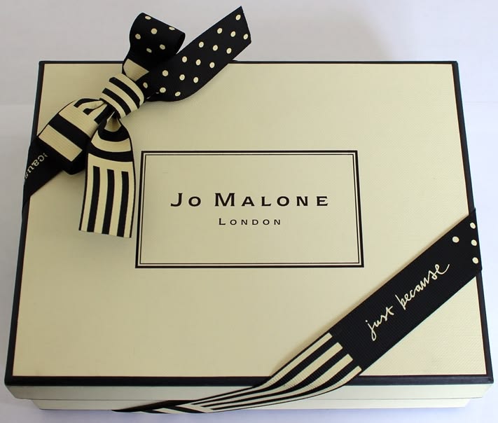
The simpler the box, the more it leans on the human touch
When the box is bare, the ribbon’s material, width, knot and finish carry everything. The weave, the crispness of the foil, the symmetry of the tie — these last-mile details are exactly what MB obsesses over in luxury bags and boxes.
Hermès: turning a shade of orange into the world’s most expensive box
📍 France · Hermès orange + brown ribbon
You recognise the Hermès box with no logo at all. That orange (nicknamed “Feu”) was born of a wartime shortage — a make-do — yet became one of the most recognisable packaging assets on earth. A perfume in that box inherits a whole house’s trust.
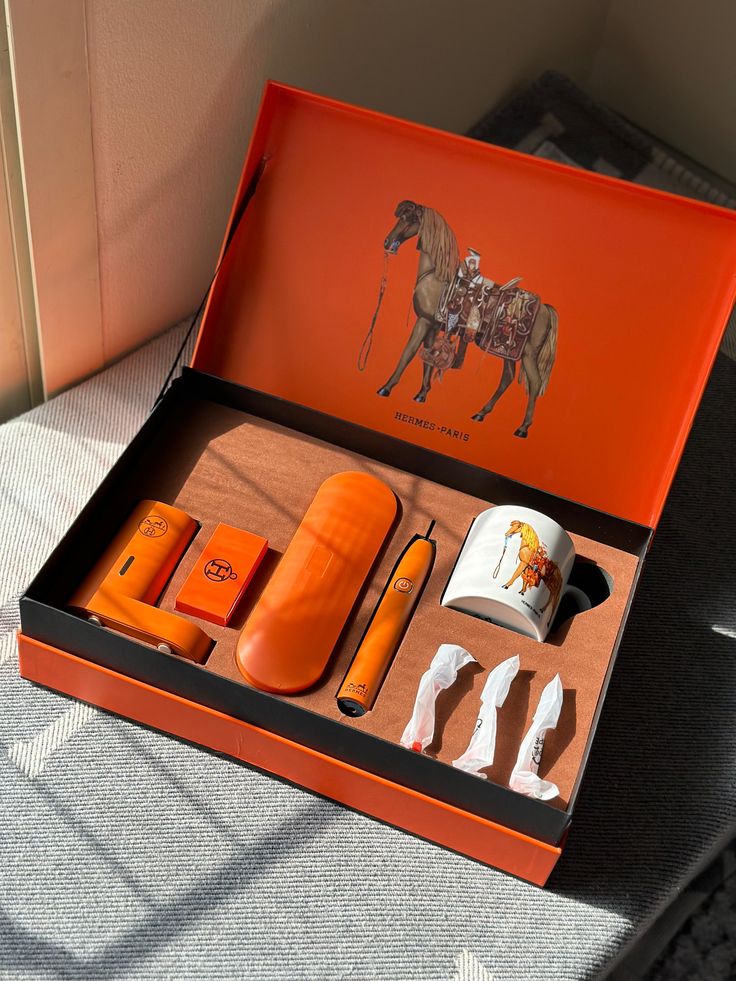
The right colour is the hardest moat to copy
Keeping one colour identical across paper, bags, ribbon and every print run takes rigorous spot-colour (Pantone) management and print QC. Locking down and reliably reproducing “that colour” is a core MB discipline in production.
Chanel N°5: confidence shown through empty space
📍 France · Minimalist white box, black border
For a century the N°5 box has barely changed: white ground, a single black rule, austere type, the square box echoing the bottle’s edges. In a counter full of foil and motifs, it stands out by doing nothing.
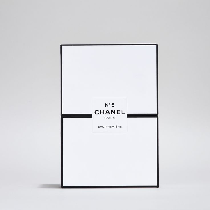
The minimalist box is the hardest — every flaw shows
With no pattern to hide behind, the whiteness of the paper, the straightness of the rule, the sharpness of the foil, the squareness of the corners are all magnified. Minimal packaging demands the highest precision in paper, print and die-cut tolerance.
Dior: a bow that whispers haute couture
📍 France · Miss Dior ribbon bow
Dior ties the couture atelier’s “bow” straight onto the perfume box. The pleat of the ribbon, the symmetry of the knot, the restraint of the palette — it makes a box look as if it was wrapped by hand in the workshop. What it sells is the feeling of being treated with care.
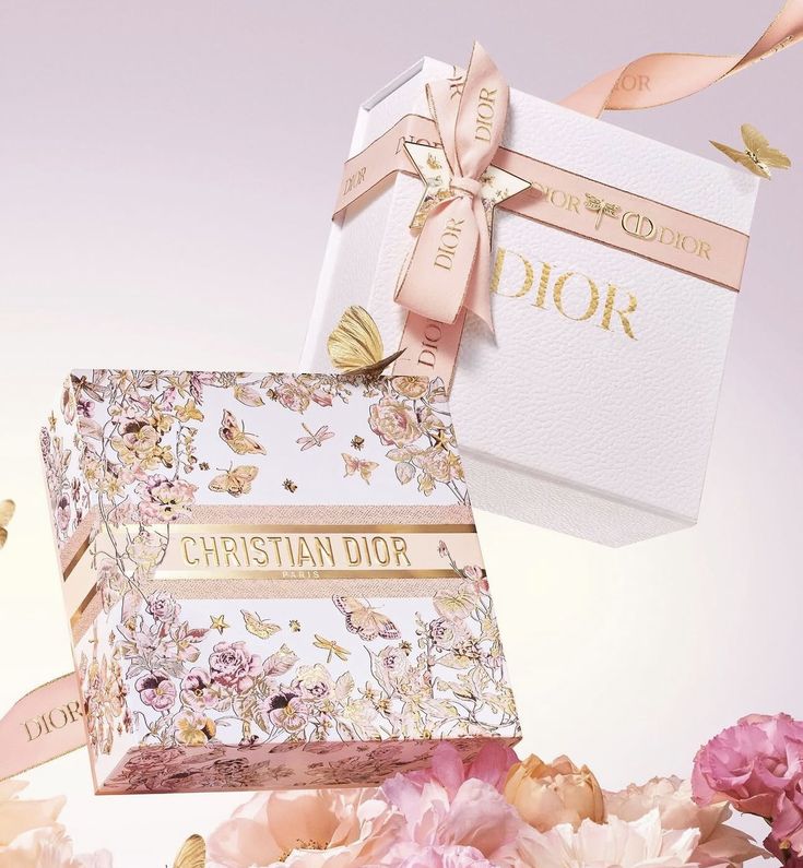
The “accessories” on a box decide whether it reads as luxury
Bows, ribbons, seals, wax stamps — the choice and execution of these packaging accessories is what lifts a box from “product” to “gift.” In MB proposals, accessories are designed as a craft in themselves, not bolted on afterwards.
Guerlain: honeycomb and gold, a refillable heirloom
📍 France · Bee motif + embossed / starry box
Guerlain embosses France’s honeycomb motif into its Bee Bottle, and the box carries the same gold-and-relief language. The classic bottle is refillable — proof that “luxury” and “durable, lasting” are not in conflict.
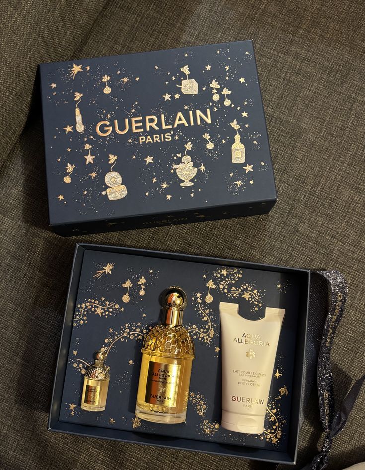
Embossed touch, plus a structure that lasts
The honeycomb relief relies on stacked embossing and foil for its tactility; refillability tests structure and fit. Building “premium feel” and “lasting use” into one package is the most valuable direction in modern gifting — and an MB focus in sustainable boxes.
Tom Ford: a black box that wears its price on its sleeve
📍 USA · Private Blend matte-black box + gold foil
Tom Ford takes an almost entirely black box, adds a restrained line of gold foil, and says it all: rare, expensive, for those who know. Here black isn’t understatement — it’s a declaration.
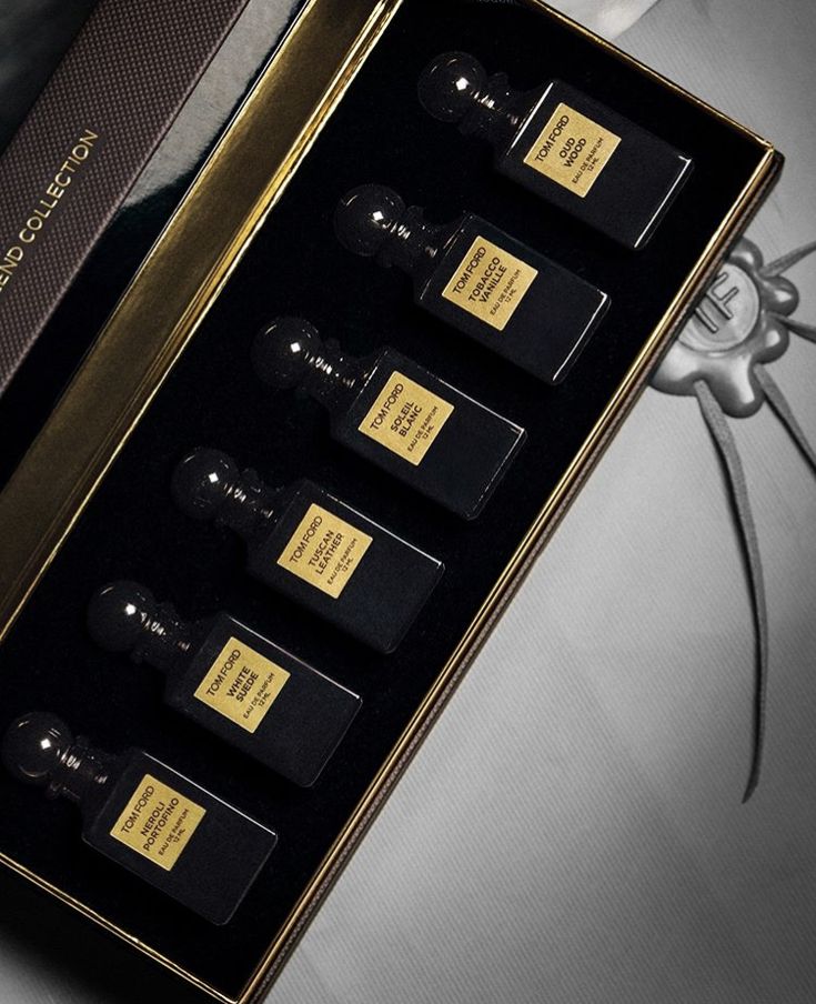
Dark boxes test foil and material the hardest
On a matte-black box, the sharpness of gold/silver foil, the matte film, whether fingerprints show are all magnified. A “luxurious black” takes repeated proofing across paper, matte lamination and foil — exactly what MB is trusted with on high-value black boxes.
Louis Vuitton: a perfume packed into a trunk
📍 France · Les Parfums refillable + leather trunk
A house born making trunks, LV makes its perfume refillable and adds a leather or canvas travel case — packaging that isn’t just a shell but an extension of the brand’s “travel” DNA, with sustainability quietly built in.
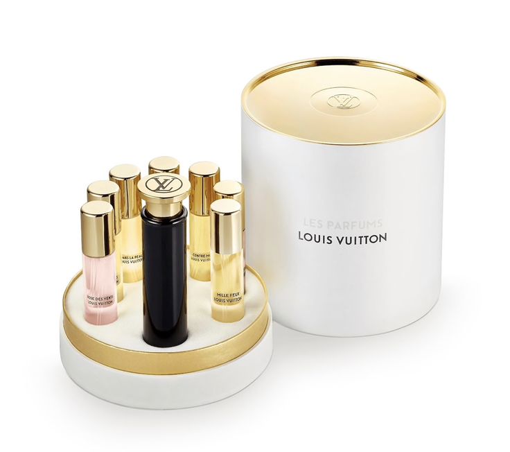
When the case is worth keeping, reduction happens by itself
Designing the outer case as something worth storing and reusing is the smartest sustainability — people won’t throw it away. That takes a stiffer structure, better materials and finer inner trays — MB’s core strength in “boxes worth keeping.”
Maison Francis Kurkdjian: box and bottle, the same red
📍 France · Baccarat Rouge 540 red-and-gold coffret
MFK’s signature is “box-and-bottle as one”: the lacquer red and gold of Baccarat Rouge 540 runs from the bottle straight into the box and accessories — the whole set reads like a single, calculated object, not a bottle plus a box.
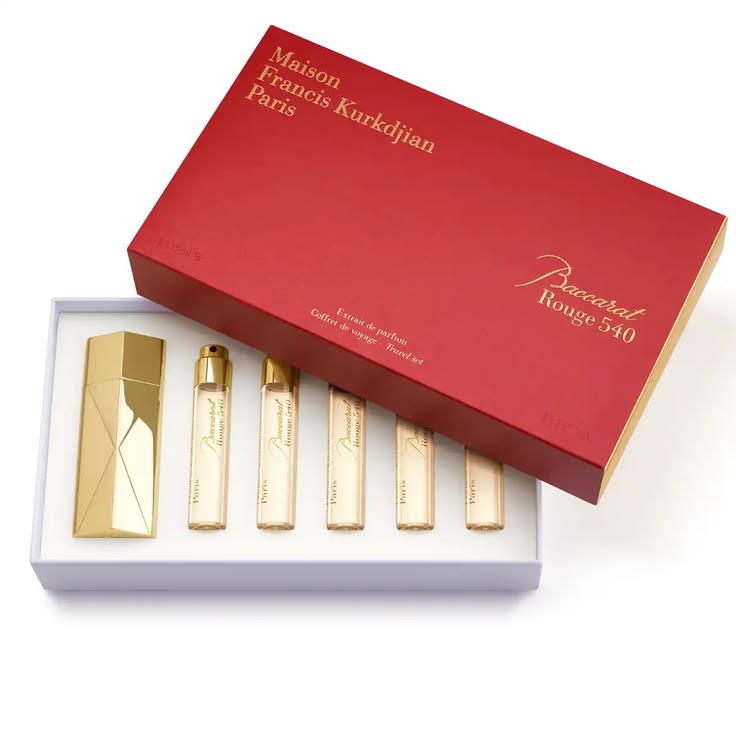
Making bottle, box and accessories “the same colour” is harder than it looks
Glass, paper and metal are different materials; rendering one identical red across them takes separate spot-colour matching and proofing. Zero colour drift across a whole set is a hidden source of luxury — an MB priority on coordinated coffrets.
Maison Margiela Replica: printing “a place and a year” onto a label
📍 France · Apothecary bottle + handwritten-style label
Replica goes the other way: a plain apothecary bottle and a typewriter-style label printing “the scene recreated · the year.” It wins not on opulence but on narrative — the packaging itself tells a story you want to own.
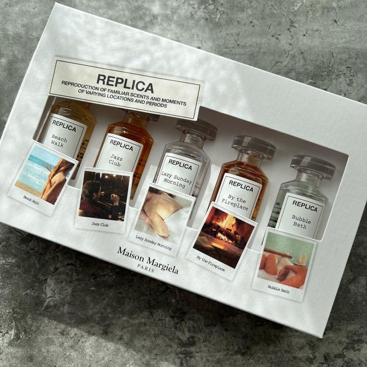
Sometimes the strongest design looks like “no design”
A plain label lives or dies on type, paper stock, label-placement precision and a worn-in feel — deliberate “imperfection” is harder to nail than gloss. Telling a story through packaging, not piling on ornament, is a powerful differentiator MB loves to explore.
Aesop: recycled paper and type, redefining luxury
📍 Australia · Amber bottle + kraft box
Aesop shuns opulence entirely: amber bottles, kraft boxes, dense functional type. It proves a premium feel needn’t come from foil — it can come from the honesty of the paper and the discipline of the typography.
A “no-foil” luxury, carried by paper and type
Going eco and minimal, the touch of uncoated paper, ink reproduction and the layering of dense information become make-or-break. Sustainable packaging isn’t plain — it’s actually fussier about paper and print, an MB specialty in eco boxes.
Penhaligon’s: turning a box into an illustrated theatre
📍 UK · Portraits sculptural stoppers + ornate box art
Penhaligon’s pushes “ornate” to the hilt: Victorian box art, sculptural cast animal-head stoppers and ribbon. It proves that in an age of minimalism, daring to be ornate is a strong brand personality too.
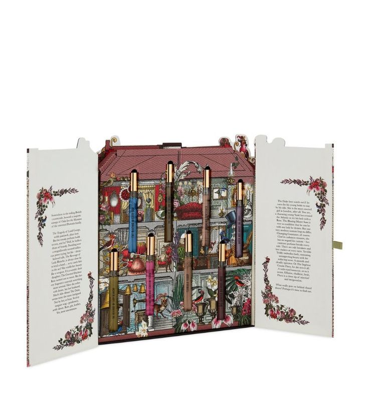
Ornate done well relies on precise die-cutting, foil and print
Sculptural stoppers and lavish box art demand shaped die-cuts, multi-colour print, foil and fine finishing all at once — far harder than minimalism. Making “ornate” feel luxe rather than gaudy is a showcase of craft — an MB forte in elaborate boxes.
Diptyque: black-and-white illustration, made to collect
📍 France · Oval label + B&W illustrated box
Diptyque uses its signature black-and-white hand illustration and oval labels to make every box a small collectible; limited tins and advent calendars are chased by collectors year after year.
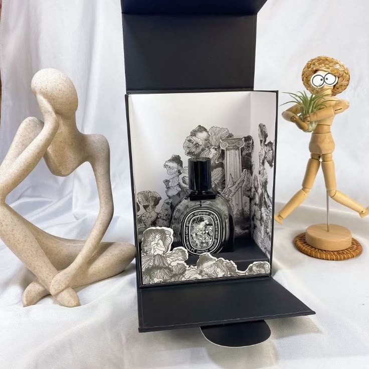
The power of monochrome print is all in “illustration” and “paper”
No foil, just black and white — it tests illustration quality, line-print sharpness and paper feel. Making packaging “a keepsake artwork” is the highest way to get a product treasured — a brief MB most enjoys with illustrators and designers.
Byredo: making “almost no design” a statement
📍 Sweden · Off-white minimalist box + pure type
Byredo pushes minimalism to near “anti-design”: an off-white box, one line of black type, nothing extra. It sits at the opposite pole from Penhaligon’s yet is just as strong — because restraint itself is an attitude.
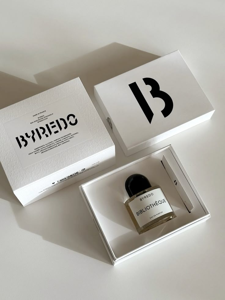
The “emptier” the box, the more it rides on paper and type
When the box face is nearly blank, the fibre and whiteness of the paper, the character of the typeface, the cleanliness of the print are everything. Minimalism is an exam where no detail can hide — MB delivers that cool luxury through the right stock and process.
Acqua di Parma: a yellow cylindrical hat-box, finished in gold
📍 Italy · Signature yellow + handmade cylinder box
Acqua di Parma pairs its signature yellow with a cylindrical hat-box, Art Deco elegance finished with gold patterning — turning “Italian handcraft” into a packaging structure in itself.
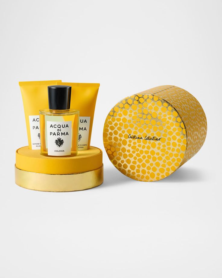
The cylinder box and its seal test structure and feel at once
A cylinder isn’t as easy as a square box — rolling, the seam, the fit of lid and base all need precision; the gold pattern or seal is the finishing touch. Building a box with an “opening ritual” is an MB focus in high-end gifting.
Creed: a crest in foil, trust packed into a box
📍 France/UK · All-over crest heritage coffret
Creed prints its house crest across a sober heritage coffret, with even the batch code becoming a collector’s mark. When packaging spells out “history and authenticity,” it sells not just perfume but trust.
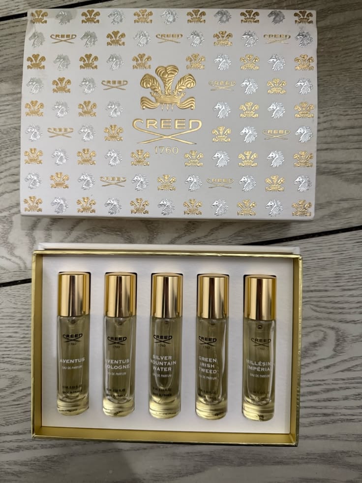
“Crest foil + sober box colour” is the recipe for trust
The crest must be foiled with finesse, the box colour deep and refined, the details able to bear scrutiny — the combination of foil, spot colour and box material builds an “authentic” impression before the box is even opened. Packing “trust” into a box is core to MB’s work with heritage clients.
When the product itself is invisible, the box is its only face.
Ribbon, colour, empty space, the bow, emboss and refill, the foiled black box, the keepable trunk, box-and-bottle in one colour, label-as-narrative, eco typography, ornate die-cutting, illustrated boxes, minimalist paper, the cylinder hat-box, the foiled crest — 15 houses, 15 signature crafts. Turning these concepts into real boxes that mass-produce, don’t break, hold colour and feel right takes countless decisions about paper, spot colour, foil, die-cutting, ribbon and inner trays — and that is exactly what we do every day.
Free sampling · 14-day lead time. From ribbon-tied boxes and foil-stamped black boxes to cylindrical hat-boxes and refillable structures, we help you nail that first glance — before the scent.
Free consultation & sampling →